UCF CENTER FOR DISTRIBUTED LEARNING
Universal Design Online Content Inspection Tool (UDOIT) Interface Overhaul
The Problem:
Onboarding faculty to UDOIT was difficult due to the amount of information, and the format made the process overwhelming. With the push for UCF online courses to be fully accessible, it was important to have a tool that was interpretable by faculty facilitating coursework.
Courses at UCF are eligible for 'quality designations,' but such badges are only given to courses with outstanding accessibility checks. With UDOIT, we want to encourage faculty to aim for this standard.
The Context:
What is UDOIT?
The Universal Design Online Content Inspection Tool (UDOIT) is a Canvas extension which was created by UCF's Center for Distributed Learning. The goal of UDOIT was to enhance online course accessibility for UCF students through providing course scans to faculty which would alert them of accessibility violations. Each scan audits a course in compliance with WCAG and ADA standards, looking out for visual, cognitive, and auditory needs, and mainly targets course elements or styles that may inhibit users from properly navigating the course.
UDOIT gets usage across the entirety of the University of Central Florida (UCF) by faculty and administrators. To encourage course quality and maintenance, UDOIT needed an interface overhaul to make information and navigation simpler.
My response:
From my own deductions, I knew that UDOIT was extremely information heavy in early screens, but not very informative as a user is resolving course violations.
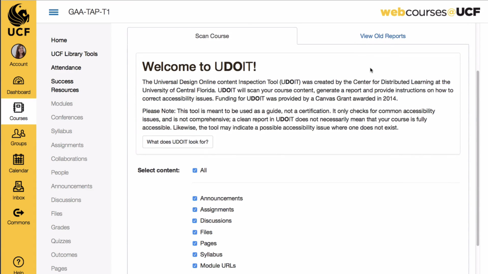
Old UDOIT Welcome Screen

Initial Notes
- Lengthy start-up process
- Considerable amount of information before beginning
- Important instructional information hidden
What I observed:
Through the usability tests, my suspicions were confirmed. Once briefed with the product and task, faculty did not want to spend much time reading and instead preferred jumping right into scanning their courses.
The problem with all of the "up-front" information was that faculty would either read through it and be too overloaded to start resolving errors, or just skip all of the information entirely. Fatigue was contributing to the lack of time spent on adjusting courses.
Despite my own judgement, however, I began by interviewing three Instructional Designers and watching them navigate through UDOIT's former interface. Through these usability sessions, I was able to gather some pain points contributing to limited usage, including the daunting welcome screen.
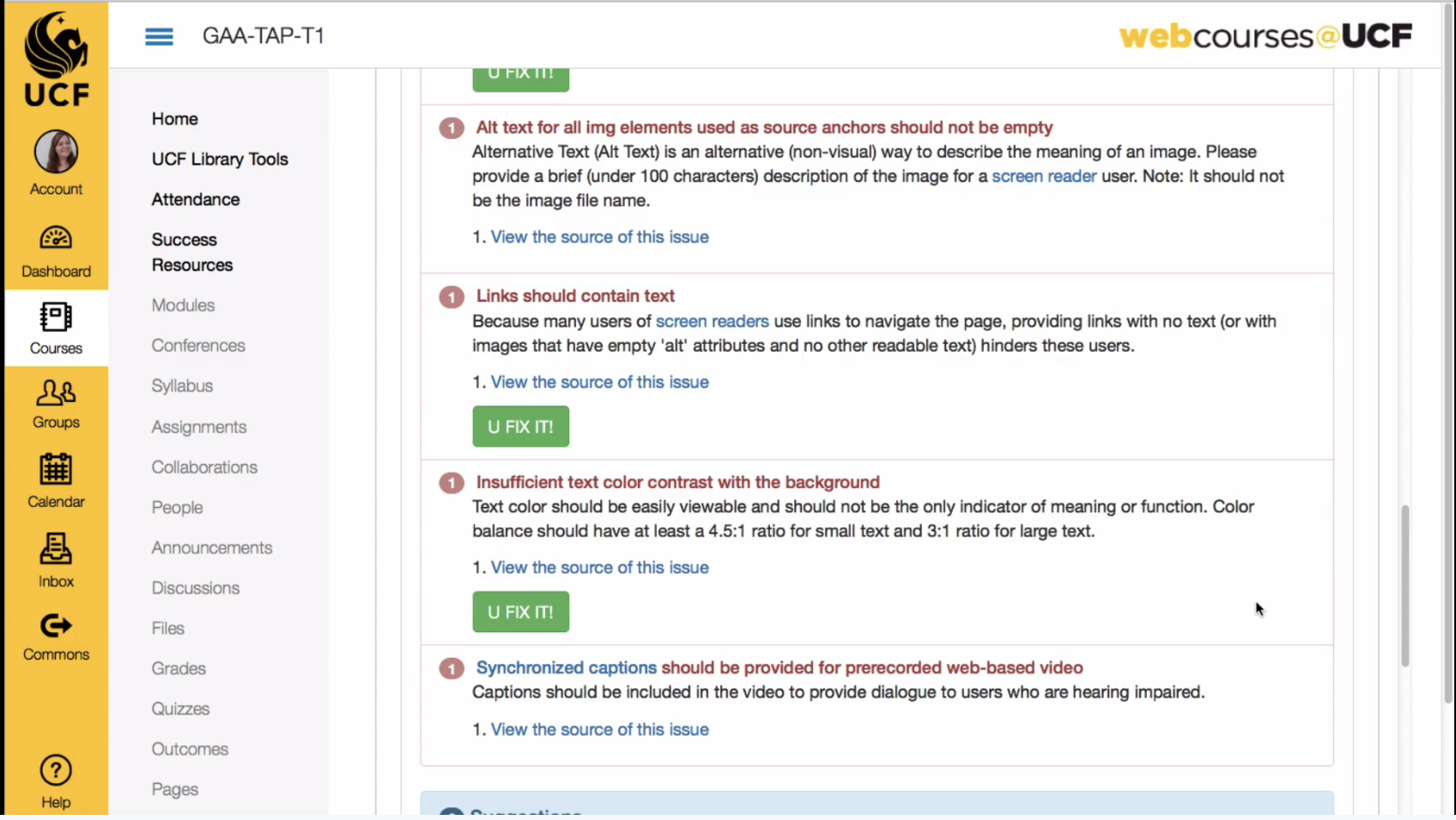
After the wall of information, faculty was also confronted with a list of errors that UDOIT found within their courses. This made UDOIT more of a challenge, as there was a lot of misused space which made the errors seem more intimidating and plentiful.
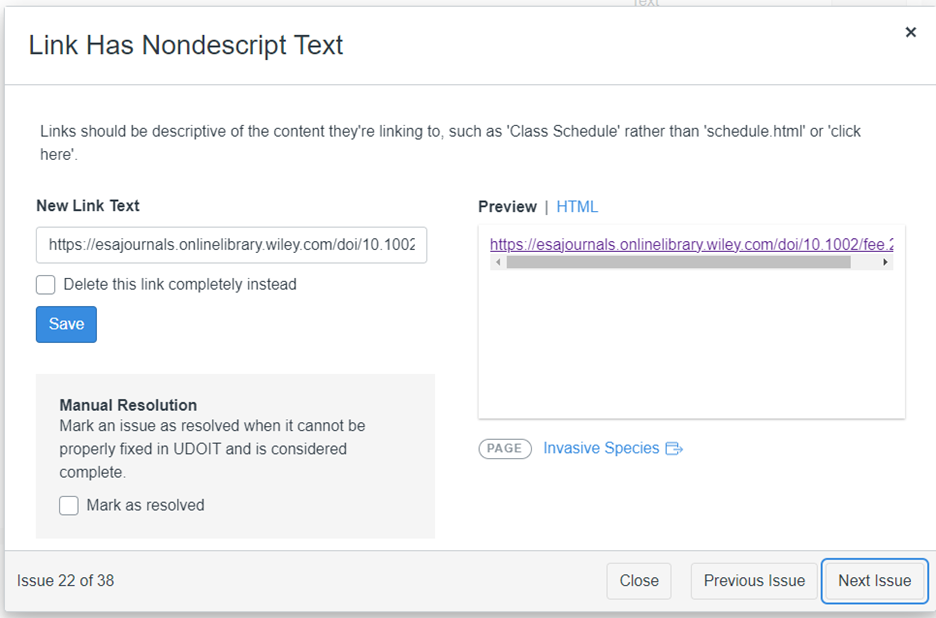
The final screen faculty is faced with is the "fix it" page, which prompts users with a widget that previews the errors they had and the changes they can make. The widget was a modal with a small display of the issue, with little surrounding context. The interactive widget was not very descriptive, either.
After watching the interviewees navigate UDOIT, I started mockups to simplify a few screens.
I started with a few low-fi/mid-fi, iterative prototypes to give UDOIT a cleaner, more straightforward feel. I blocked off the Canvas navigation area and represented a better list structure for the errors.
My design skills at the time were very new and very fresh, so I hadn't learnt about components or even how to properly model modern design practices.
Initial Error Screen Mockups
+++
After discussion with the team, we were able to come up with some new ideas, and I greatly improved on my mockups. I taught myself how to properly prototype my designs, and even started using Figma's reusable component libraries. The quality of my mockups and frames improved, and I was able to better communicate a solution for our UDOIT problem.
In that same stage, we were able to come up with a few objectives.
- Make UDOIT navigation simpler
- Make the "fix it" widget actually helpful
- Make UDOIT fun, with goals and progress visuals
Ultimately, we wanted UDOIT to feel like the user has help at every step along the way.
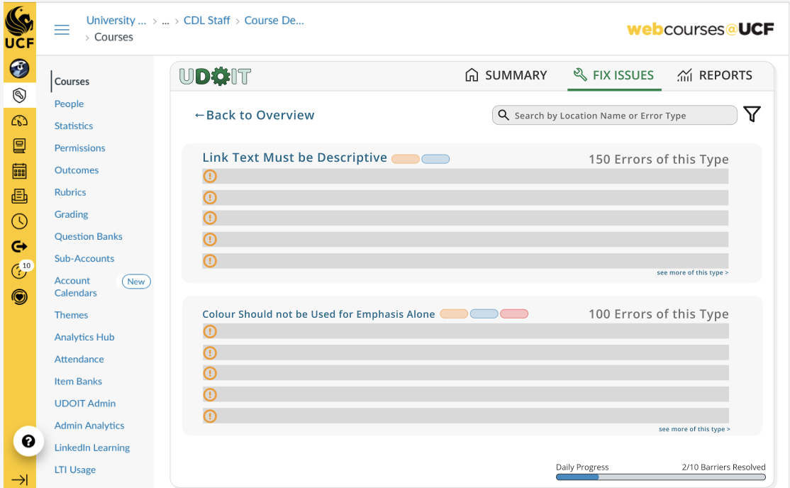
And from those conclusions, I produced the following screens:

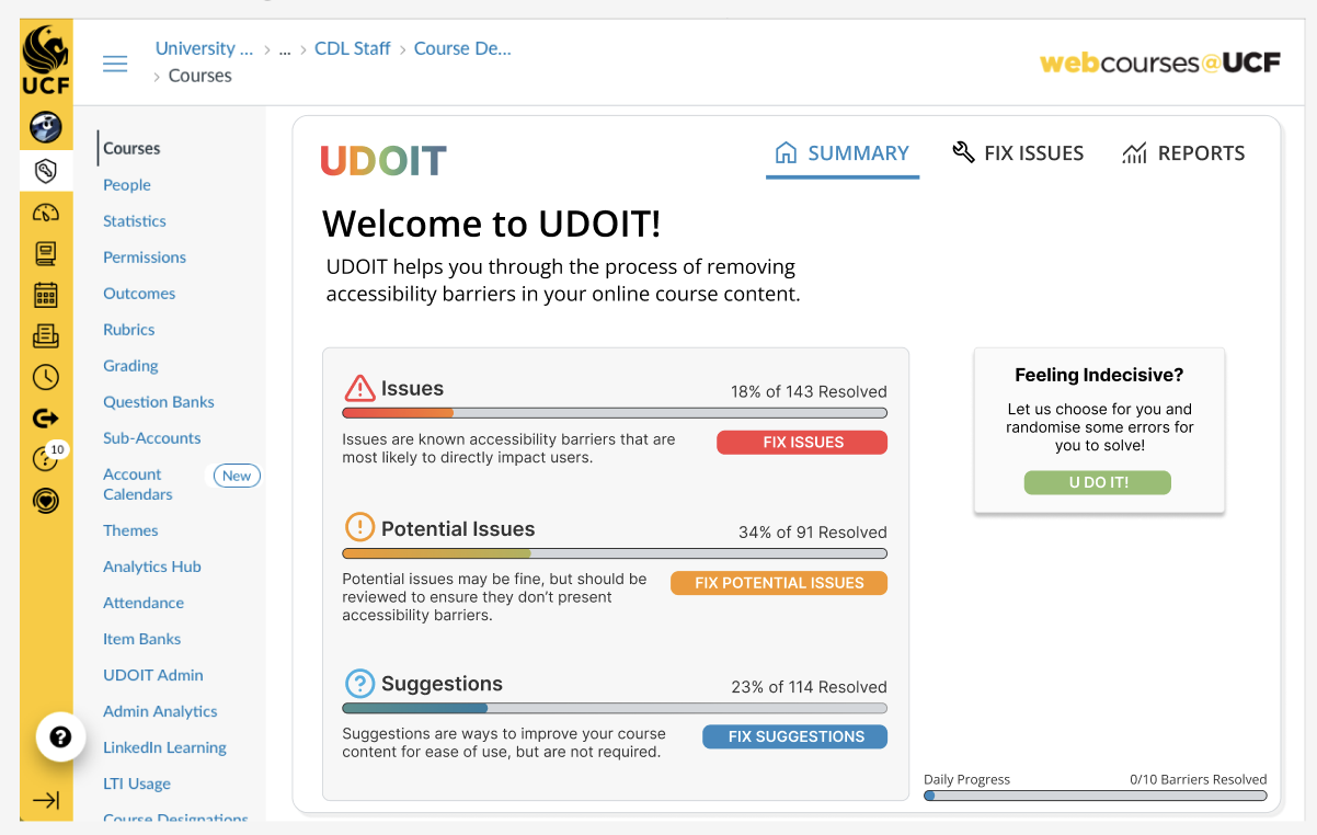
- The first screen focuses on simplifying the welcome experience. No more long lists of texts or decisions to make on the first start up.
- The second screen fixes our navigation problem. Chunked sections for the different hierarchy of violations that UDOIT scans for.
- The final screen addresses the issues users were seeing. By having issues sectioned off, they can address every instance of the issue.
The only problem? Instructional Designers thought the colours were overwhelming, and seeing so much red was scary.
We didn't want UDOIT to feel scary!
We brought it back to drawing board. Toned down the colours so they weren't doing most of the communicating, and mocked the fix it screen.
The result?
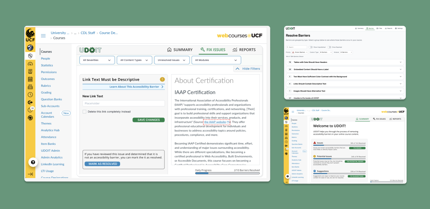
Clean, simplified screens that made the product feel much more complete.
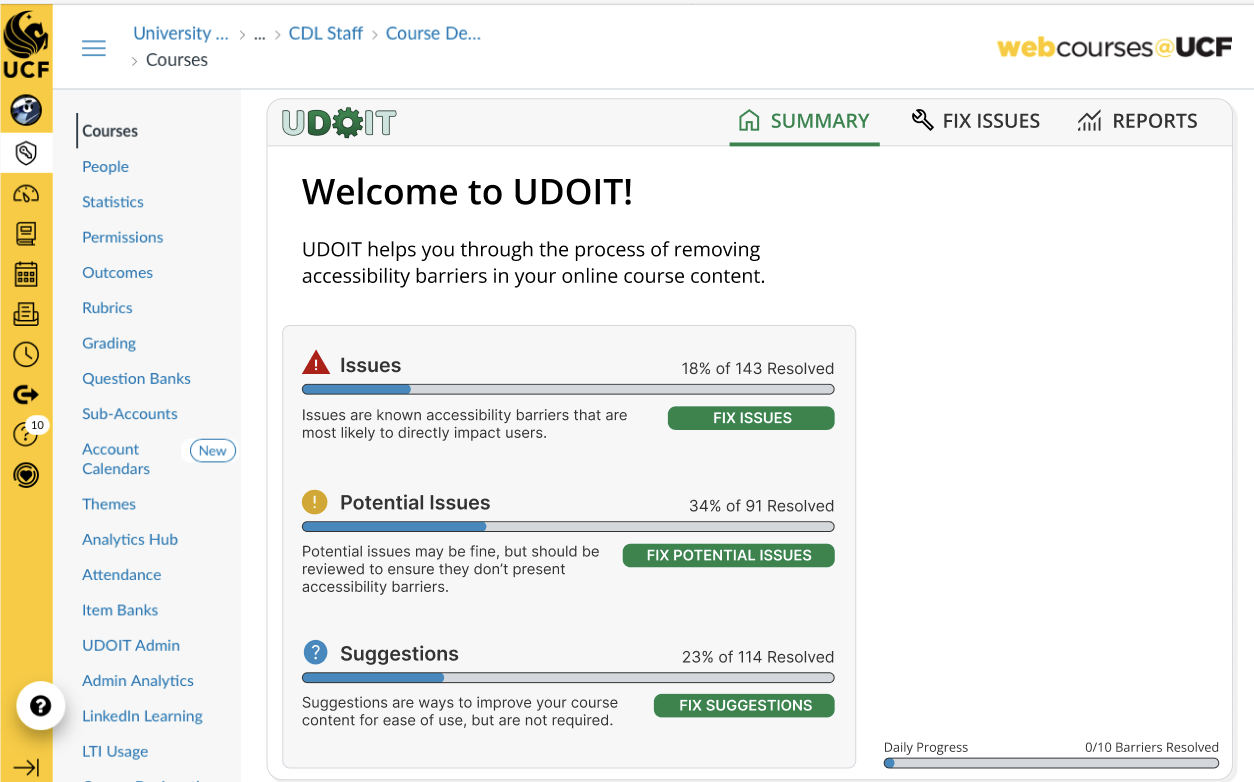
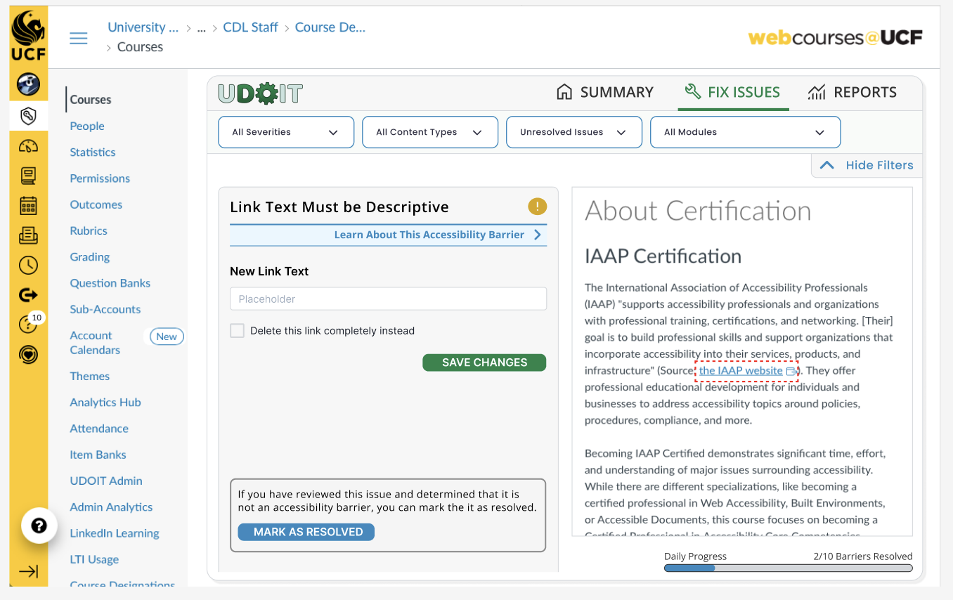
It was at this stage where each iteration felt as though they had finally come together. The issues were approachable, and there was no lack of explanation no matter the step a user was at. An added "learn more" banner gave the user built-in resources without routing them back to the first screen or to an external source.
My final request.
Dropdowns for errors. The issues aren't represented here, but they were listed out and extremely daunting. Instructional designers were excited about our progress, but still felt like the errors were overwhelming.
Similar to my initial errors list mockup, I really wanted to see errors grouped together. I suggested dropdowns, and got pushback by the team.
It took some convincing, but after suggesting it to the instructional designers, it turns out it was exactly what UDOIT needed!
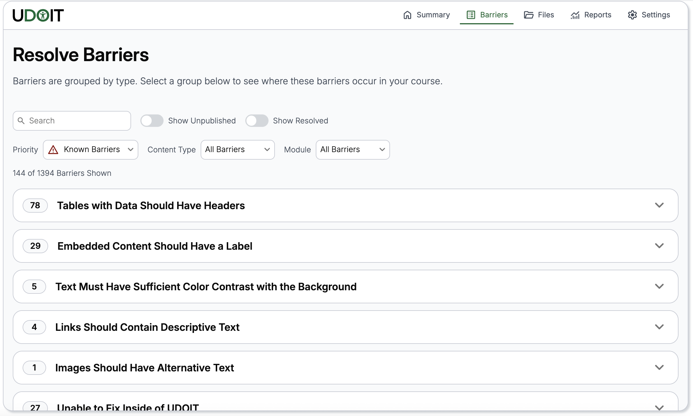
Dropdown UI
Finally:
UDOIT received its initial UI overhaul with the changes discussed above. After going through our UI/UX team, one designer reviewed the work and made some further adjustments, and the product is now live with those changes.